You must log in or register to comment.
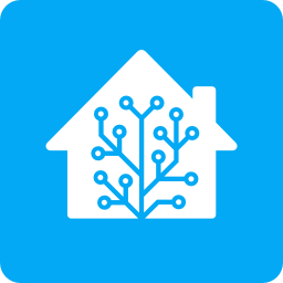
Simple and effective, looks pretty good
The old logo was a better portrayal of my tangled web of smart home stuff lol
…there was already a simple version used for favicons that didn’t look as bad, it’s the one on the right. Switching to just using it for everything would be fine, instead of this… thing with the awkward left branch joining the main one at the bottom.
I like the new one way more, the old one is too symmetric.
New one is way better, the old ones were alright but borderline programmer art level
I sorta hate it.
It’s not immediately recognisable as a house anymore which is bad for attracting new users. Also the “antenna” is less interesting and used to be immediately recognisable.


