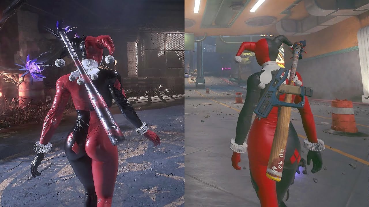
Batman might have lower polygon models, worse textures and technically inferior lighting, but it has so much better art style and art direction it looks waaaay better as a whole IMO.
Yeah, texture fidelity is one metric but for textures really how good or bad they are depend much more on the skill and attention to detail behind making it more so than raw numbers. The models themselves is really the only part where the increased polycount actually shines through and makes it competitive because it is so important to make things like hands, hair and clothing look "right’. But the aesthetics of SS is just so bland and flat that it ends up looking like an old tech demo.
Well, even 2011 Arkham City looks better than Suicide Squad IMHO: https://www.youtube.com/watch?v=YvPgiSNQDS4
Ouch, why does Suicide Squad look so flat and washed out?
OMG 🤦♂️
At 2:30 did Harley get put back in the game with a Mario Bros bubble? Wtf
Here is an alternative Piped link(s):
https://www.piped.video/watch?v=YvPgiSNQDS4
Piped is a privacy-respecting open-source alternative frontend to YouTube.
I’m open-source; check me out at GitHub.
0:28 is the deciding factor, clearly.
Ass
But is it more fun?
According to all early reviews… no
I can say that there were a lot of sponsored streams recently. Often when a streamer enjoys a game, they will keep playing when their sponsored segment is over. I’m not aware of one that played any longer than the sponsored minimum.
The moon at 1:10 is so comically huge.
Here is an alternative Piped link(s):
https://piped.video/iocRbdvUgJ4
Piped is a privacy-respecting open-source alternative frontend to YouTube.
I’m open-source; check me out at GitHub.
Bro, look at the bus stop “benches” at 1:33. What the fuck is that? I thought Metropolis was supposed the be “the city of the future.”
Not sure if you’re referring to the graphics or to the shitty bench design. If the latter…it’s a real thing. :(
They’re called “leaning benches” or “lean bars”. This bench design is sort of “futuristic” in the sense that adoption has only recently started taking off around the world. They are a user-hostile design made specifically to prevent people (specifically homeless people) from lying down, sleeping, or otherwise, y’know, using it as a goddamn bench. Because removing the ability for anyone to sit down is apparently, in the eyes of authorities, a small price to pay to make homeless people’s lives that much harder.
The Wikipedia article for “Leaning bench” redirects to hostile architecture, where you can read more about this and similar efforts, if you are in the mood to be enraged at the sheer malice of bureaucrats.
I’ve seen them in several cities across America. NYC starting rolling them out within the past decade and you’ll see them in any recently renovated station. See https://www.nydailynews.com/2017/09/11/subway-riders-slam-brooklyn-stations-new-leaning-bars-as-incredibly-unwelcoming/ (scroll through the image slideshow to see the new).
Not sure if the image embed will work here but I’ll try:

My city has both benches and these. I like these because I can lean on them without removing my backpack. I think it really depends on the City whether their hostile or not. I also noticed McDonald’s has them in their order waiting area too.
It’s pretty simple, if they’re being used to replace benches to stop people sleeping there, they’re hostile. I certainly wouldn’t mind having them in addition though.
Right? Like maybe a normal bench, then a seat or two like this, in case someone actually decides to sit there.
They’re good for people with mobility issues who would struggle to fully sit down on their own and get back up again, so they do serve a valid purpose. But they suck for everyone else.
I already knew what it was irl-design-wise, I’m mostly shocked that the devs decided to use that style of bench for the bus stops in the game. Sort of like “I can’t believe they’re using this style as a way of normalizing it” kind of thing.
Did they use the same engine as DOOM?
Im gonna be honest, i prefer the newer one. Looks much easier to read the playscape without all the dark gritty glooomyness. Feels more like an animated show palette.
Aesthetics matter more than realism.
And people are saying that the aesthetics of all four previous Arkham games is easy better. Having watched some comparisons, I’d have to agree with them.
Models look better. That’s about it imo. The ambiance is ruined in comparison.
lol
I agree with you about the artistic choice of going for something flatter and more reminiscent of the animated show. Or perhaps of Fortnite, because let’s not kid ourselves, they are aiming for that crowd. But I actually do like that art style! YMMV.

